College Fonts
Typography plays an important role in communicating an overall tone and clarity. Careful
use of typography reinforces our personality and ensures clarity and harmony in all
Green River College communications.
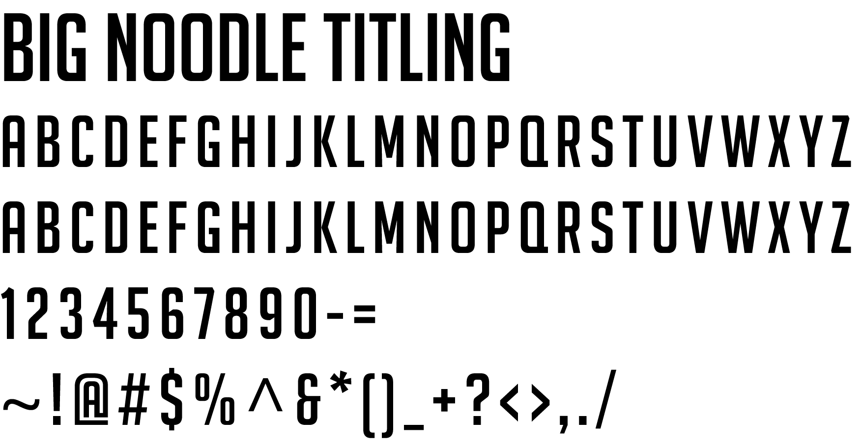
The official College typefaces are Big Noodle Titling and the Avenir Next LT Pro font
family and these should be used on College print publications. The typefaces are licensed
and are widely available for purchase.
In the event that you do not have access to these fonts, other suggested fonts are
Impact and Arial.
| Primary Font: | Big Noodle Titling |
| Designer: | James Arboghast |
| The Font: | A generic set of capitals built on the gothic even width principle, built from squared forms and a simplified finish, Big Noodle Titling delivers excellent clarity in any medium. This type is industrial in essence with a contemporary treatment, a robust work-a-day typeface that is more about the message than the font. |
| Appearance: |  |
| Alternative Font: | Impact |
| Alternative Font Appearance: |  |
| Primary Font: | AvenirNext LT Pro (Roman and Italic) |
| Designer: | Adrian Frutiger |
| The Font: | Avenir is the French word for “future.” This font takes its inspiration from the geometric rounded fonts of the 1920s to embody a more organic interpretation of this geometric style. This type is contemporary and modern and lends these qualities to the message it conveys. This is Frutiger's second edition of the Avenir font. |
| Appearance: |  |
| Alternative Font: | Arial |
| Alternative Font Appearance: |  |